APP REDESIGN
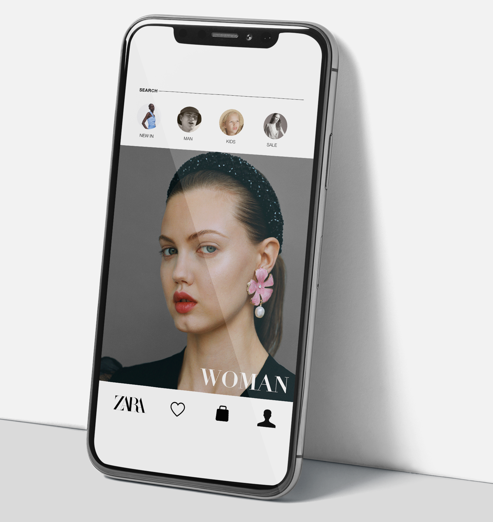
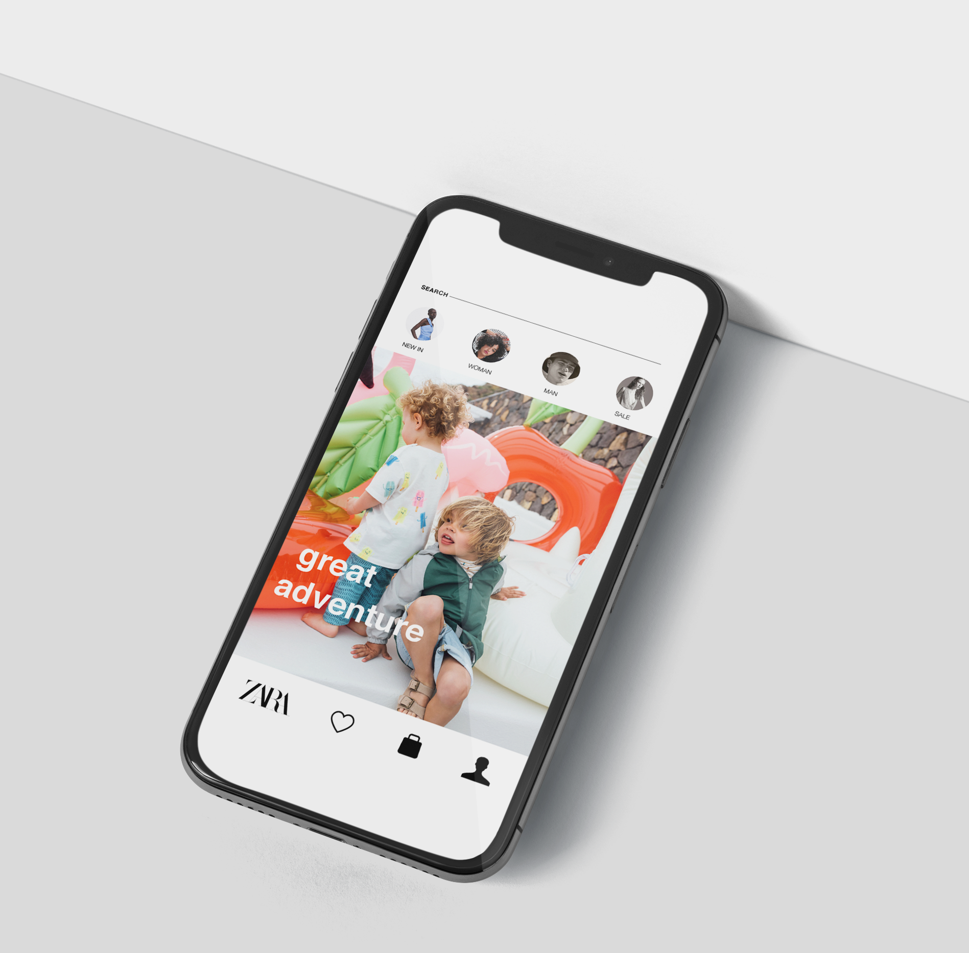
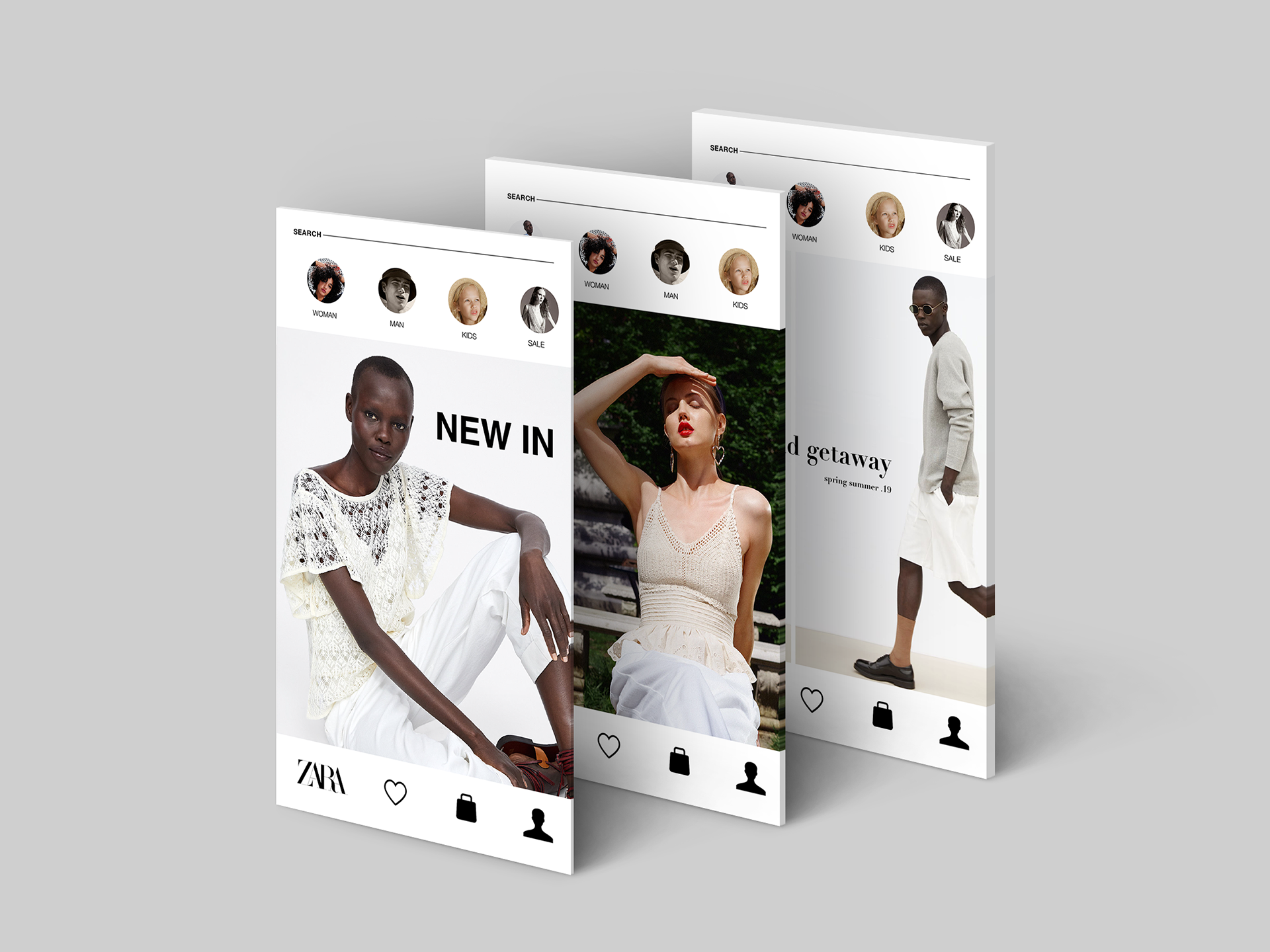
Interaction Design is the practice of designing interactive digital products, environments, systems, and services. Through a UX Design graduate course at the University of Baltimore, I had the opportunity as a part of a team of two, to explore methodologies for ideation, research, testing and prototyping for a redesign of the ZARA application. Please find detailed throughout this website interactive prototypes.
CHALLENGE: We identified a number of issues preventing satisfactory user experience during our preliminary evaluation of the ZARA app. The app had an attractive visual design and information design centered around “garment collection stories.” The latter complicated the navigation design, which made using the app cumbersome for users. For the purpose of this project we identified two of the primary challenges to focus our research and redesign efforts-non intuitive navigation and information architecture.


OBJECTIVE: Our objective was to simplify and streamline the shopping experience for customers and make the application task-oriented. Ultimately our goal was to satisfy the needs and desires of the people who will interact with the product the most.

RESEARCH: We conducted both informal and formal usability analyses of the app. User tasks were identified through formal analysis. The results of the formal analysis of the ZARA app using Nielsen’s heuristics were used to guide us in the selection of identifying and developing user tasks.
STRATEGY: Methods that we had the opportunity to employ included utilizing sketches, wireframes, flowcharts, storyboards, decision and journey mapping. Through persona development, prototyping, competitor reviews and phased observational data testing, I had the opportunity to explore interaction design and focus on the design of behavior.
____________________________________________________________________________________________________

____________________________________________________________________________________________________
PERSONAS + SCENARIOS: We conducted a series of interviews and questionnaires across a myriad of persons of varying backgrounds, demographics, socio-economic status to identify representation of the app’s intended users. User personas were described as real people and we focused design activities by prioritizing useful features to our constituents through the use of scenarios.
____________________________________________________________________________________________________
____________________________________________________________________________________________________
FLOW CHARTS: We used UX flows also known as diagrams to display the complete path a user took to complete tasks (also known as current states) and then also used UX flows to determine the path a user should follow ( also known as ideal states) when utilizing our redesigned app. Please find below examples of two ideal states for two tasks to be performed by the user.
____________________________________________________________________________________________________


____________________________________________________________________________________________________
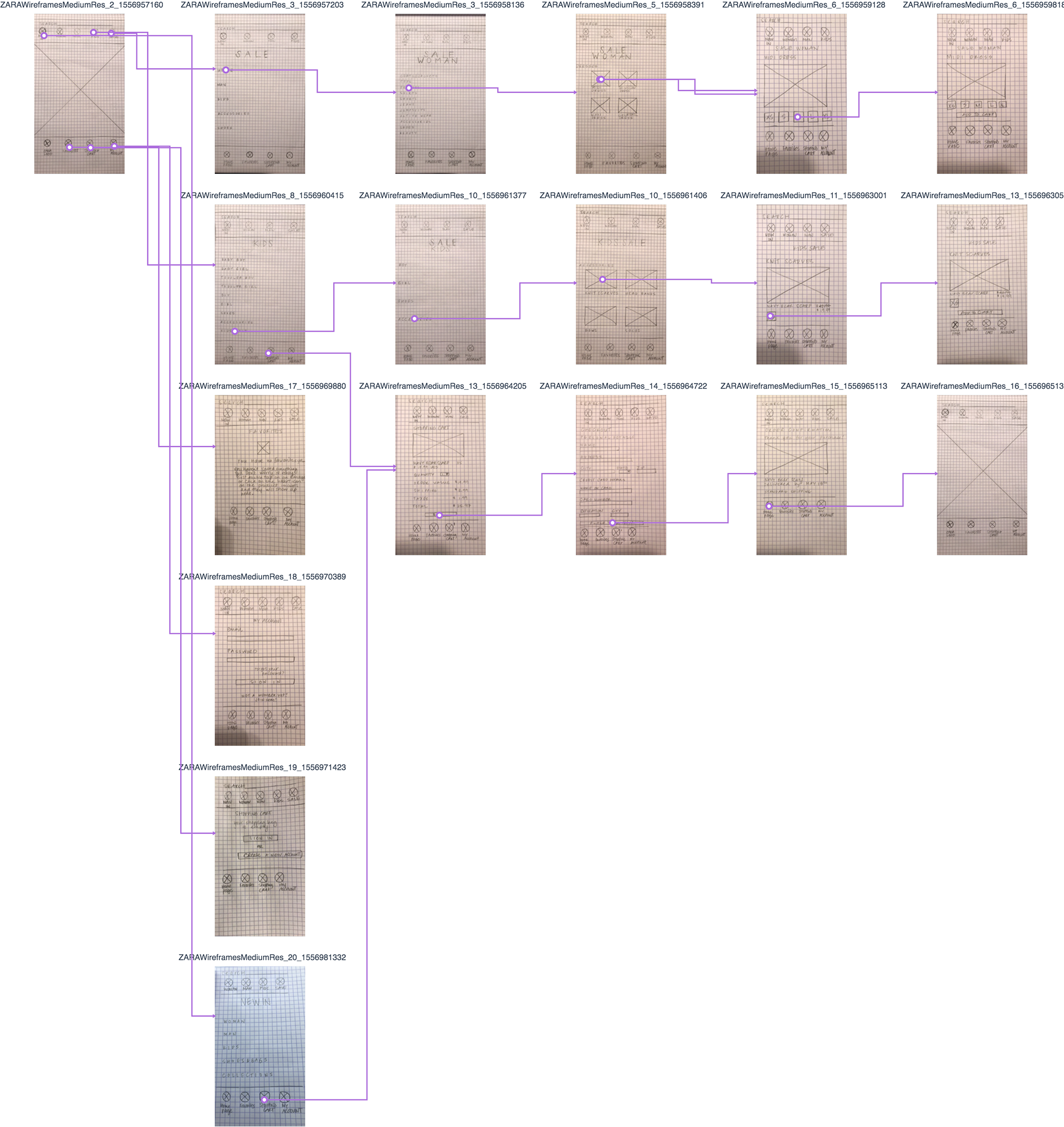
PROCESS: Prototyping played a vital role in the process of creating our design. Through the use of LoRes, MedRes and HighRes prototyping we were able to reveal our design intent. The simulation of the final interaction between the user and the interface helped us to ensure the design concept would work as intended. Below you will find a flow map for MedRes protyping.
____________________________________________________________________________________________________

____________________________________________________________________________________________________
CONCLUSIONS: Our key recommendations for the ZARA app redesign included, reorganizing and labeling and simplifying navigation, standardized page layouts, and recategorizing content and inventory.
____________________________________________________________________________________________________